|
–Geoff-Hart.com: Editing, Writing, and Translation —Home —Services —Books —Articles —Resources —Fiction —Contact me —Français |
You are here: Articles --> 2010 --> From theory to practical implications: the example of data graphics
Vous êtes ici : Essais --> 2010 --> From theory to practical implications: the example of data graphics
by Geoff Hart
Previously published as: Hart, G. 2010. From theory to practical implications: the example of data graphics. Intercom February 2010:34–35.
My discussion of typography (Intercom, July/August 2008, December 2008, and February 2009) examined the subject from a theoretical perspective, and in the end, I concluded there may not be a single optimal solution: so long as you pay attention to simple typographic rules, you won't stray too far from producing a legible document.
That being the case, it seems a bit contradictory that information designers worry so much about the cognitive costs of small factors on the readers who must decipher our words and images. After all, you'd think that "good enough" solutions really are "good enough", and that intelligent audiences can overcome these minor costs and still have plenty of energy left to understand our message.
Unfortunately, considerations that seem purely theoretical often have important consequences. In the present article, I'll use three simple graphs to demonstrate how even little things can trip up our audience.
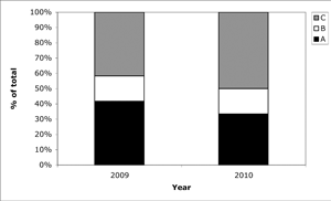
Figure 1. A cumulative-total stacked bar chart for a fictional three-item budget.
I try to avoid such graphs for a good reason: Although they present a large amount of data efficiently in a small space, they communicate the value of any individual component poorly. Calculating each value other than that of the lower component (A) takes three steps: extending two lines horizontally to the vertical axis, reading the numerical values at the top and bottom of that component using those lines, then subtracting the smaller value from the larger to calculate the difference. Second, each step provides an opportunity for error. If our primary goal is to communicate the value of each component and how it changes over time, plotting the values side by side as individual bars is more efficient: it eliminates the need for one estimate and the arithmetic, and permits direct comparison of the heights of each bar.
Another problem lies in the nonstandard nature of this graph. Some authors create a very similar graph that uses the top of each component of the bar (not its length) to represent the value of that component. (You can see this more clearly if you imagine a bar for B standing behind the bar for A, and a bar for C standing behind both the other bars.)
For example, in 2009, A would still have a value of 42%, but B would equal 58% and C would equal 100%. That's not a common misreading, but it happens more often than you'd think. Twice in the past year alone, I've seen scientists misread their own graphs in this way and reach faulty conclusions. (This has happened so often in the 25 years I've been editing data graphics that I regret not having collected statistics.) If I hadn't noticed these errors, they would have been published, since the journal's peer reviewers missed the errors, and I identified them only during final editing of the papers.
In The $10 Trillion Hangover (Harper's Magazine, January 2009, page 32), two economists described the massive increase in the U.S. national budget deficit over the past decade. (Please note: My goal here is not to cast political stones. I'm simply choosing a revealing example.)
Figure 2 dramatically simplifies their graph by illustrating only the data relevant for this example. At first glance, it's clear that total spending increased sharply, from $2.2 trillion in 2000 to $3.1 trillion in 2009. More careful inspection will reveal that defense spending (the gap between total and non-defense spending) increased the most: the distance between the two graph lines widened during this period. The increase doesn't seem particularly severe ("only" $0.3 trillion) until you realize that it represents a proportional increase of 75% (Figure 3)—more than twice the increase in non-defense spending and almost twice the increase in total spending. Both figures contain the same information, but Figure 3 shows the relative magnitude of each budget component more effectively.
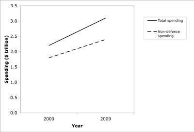
Figure 2. A cumulative-total graph of total and non-defense spending; defense spending equals the gap between the two. Source: Harper's Magazine (January 2009, page 32). The data have been drastically simplified to present only four of the original graph's dozens of data points.
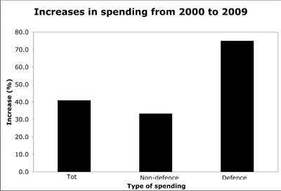
Figure 3. The same data in Figure 2, but expressed as the rate of increase in each budget component. Percentages were calculated from the data in Figure 3.
In the original graph on which Figure 2 is based, the graph's creators successfully dramatized the magnitude of the overall deficit problem, but failed to clearly portray the magnitude of the increase in defense spending. Figure 3 reveals the solution: where possible, design each graph to communicate a single concept so readers can do as little work as possible to extract the intended meaning.
The theoretical considerations that underlie this problem are simple enough to appear trivial, and skeptics might argue that anyone truly interested in the data will do the work required to understand it. My experience is that even experts such as scientists won't always make that effort. Many readers would miss the dramatic differences in the rates of spending increase in Figure 2; the difference can't be missed in Figure 3.
In information design, the challenge is always to think carefully about what we want to say and how we can communicate that message most efficiently. Like a nomogram, Figure 2 is an effective tool for presenting a large amount of data to dedicated readers willing to calculate all the various combinations of values hidden in this graph. But to communicate only the rates of increase without forcing readers to do the math, Figure 3 is far more effective.
If you're interested in learning more about data graphics, please contact me to request future articles on this topic.
©2004–2024 Geoffrey Hart. All rights reserved.