(a)
(b)
(c)

|
–Geoff-Hart.com: Editing, Writing, and Translation —Home —Services —Books —Articles —Resources —Fiction —Contact me —Français |
You are here: Articles --> 2013 --> Effective infographics
Vous êtes ici : Essais --> 2013 --> Effective infographics
By Geoff Hart
Previously published as: Hart, G. 2013. Effective infographics: telling stories in the technical communication context. http://techwhirl.com/effective-infographics-telling-stories-in-the-technical-communication-context/
The word infographic is a portmanteau created by jamming together two words: information that you want to convey in a graphic form. You might be tempted to think of this in terms of bar graphs and similar representations of numbers, but that obscures an important distinction. Bar graphs and their cousins (line graphs, pie charts, etc.) are more properly referred to as data graphics: they primarily present numbers, and although well-designed ones also help viewers understand the meaning of those numbers, they’re still highly abstract and leave interpretation of those numbers to the viewer. In contrast, an infographic informs—it helps the viewer to translate raw data into meaningful information, and the accuracy of the data is less important than the accuracy of the message.
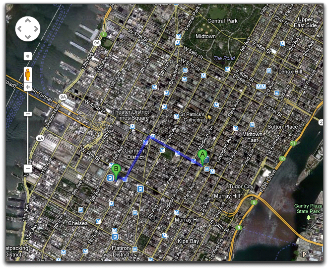
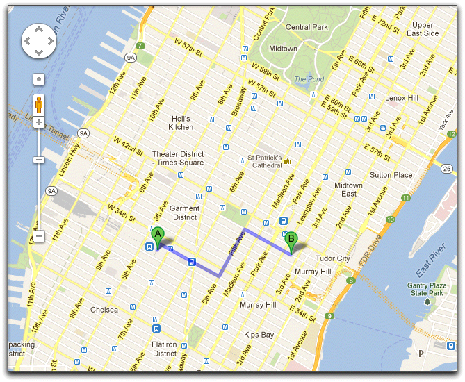
Although infographics frequently include one or more data graphics, the presence of data is not required. The primary goal of an infographic is to convey information, whether in the form of numbers, a map that shows spatial relationships among items, a diagram that conveys the relationships among the parts of a whole, a flowchart or network diagram that reveals the pathways between concepts (as in the case of a mind-map diagram), or an assembly guide that tells the viewer how all the parts fit together to create a functional whole. Infographics may be relatively literal, as in the case of a geographic map that accurately portrays the terrain, or more metaphorical, in the sense of simplified directions (Figure 1).
(a) |
|
(b) |
|
(c) |
|
Figure 1. Infographics may be (a) highly literal, as in this Google Maps satellite view of the walking directions from Grand Central Station to Madison Square Garden; (b) somewhat literal, as in this Google maps street map of the same course; or (c) highly abstract, as in this diagrammatic illustration of the same walking path. Note that an even more literal version of (a) would be a series of Google street view images.
The key differentiator between infographics and traditional data graphics is that infographics tell a story, often in an attempt to persuade or teach. To do so, they may integrate large chunks of text with visually interesting graphic elements that support that text. Technical communicators will recognize this in the form of product diagrams that inventory the parts of a product (Figure 2A), or procedural graphics that show how to accomplish a process by moving stepwise through a product’s user interface within a single diagram (Figure 2B).
(a) |
 |
(b) | 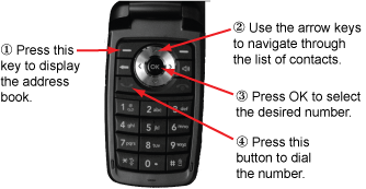 |
Figure 2. Examples of infographics that show (a) the layout of the interface tools provided by a product and (b) how to navigate through a product’s interface using those tools. Source: Hart (2010).
If you’re primarily a writer, you’re probably most comfortable with words. But infographics offer a powerful advantage over lonely words: We humans are intensely visual creatures, and a story told visually, in combination with text, is often more compelling than alternative formats. Images have the ability to invoke emotions in ways that cold, hard words and facts often fail to accomplish. This means that infographics, even the ones that have cold, hard facts at their core, resemble marketing more closely than they do science, and depend more on classical techniques of rhetoric (the art of persuasion) than on more abstract appeals to reason. This combination of factors accounts, at least in part, for the continuing popularity of comic books and graphic novels nearly two centuries after their invention as a distinct medium. Indeed, it helps if you think of infographics as resembling little comic books or the daily cartoons that appear in newspapers rather than traditional documentation: the visual aspects dominate, to the extent that words may be largely unnecessary in some cases.
The design of an effective infographic begins with a careful consideration of the knowledge, idea, or feeling that you want to convey—in short, on your message. Having chosen the message, it’s then necessary to understand the graphical tools you can use to convey that message, and the rhetorical tools you can use to tell an effective story.
Different types of infographics have different required image characteristics. Using the categories that I started this article with as examples, consider the following characteristics:
Other types of infographic have different narrative (story) or rhetorical (persuasive) characteristics. These examples illustrate the importance of visually labeling parts of the infographic to communicate the concepts of like and not-like, spatial relationships, movement through the image, and so on. Jacques Bertin (1983) provides the classic reference on this subject, but in the form of a large and sometimes complex book; I’ve provided a link to a much shorter and more accessible discussion of this topic at the end of this article (Hart 2007b).
(a) |
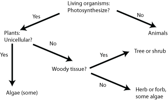 |
(b) |
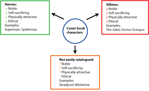 |
Figure 3. Effective infographics that show (a) a flowchart that expresses the relationships between various living organisms in a hierarchical manner and (b) the relationships between various conceptual characteristics. (A more visually compelling version would include images of the superheroes themselves. [A look back: but because they're all copyrighted, I didn't try tracking down licensing information; you'll need to Google those images.—GH])
Effective infographics must utilize a visual “vocabulary” that viewers understand. This vocabulary can be learned, as in the case of road signs and computer icons that are only effective because we have learned their meanings; most are not intuitively obvious. For example, we learn that green road signs convey location information, whereas black and white signs convey speed limits. Similarly, young users of modern software may have never seen a floppy disk, yet they learn to recognize this icon as the one you click to save your document. (With the explosive growth of cell-phone photography, the standard camera icon used to represent this functionality may undergo a similar loss of recognition, particularly in developing countries where cell phones are ubiquitous and cameras are rare.) Other images have powerful associations that are only apparent when you know the history of what the image represents, such as understanding that mushroom clouds represent a nuclear horror. The vocabulary can also be obvious without explicit teaching, such as using the image of an ice cream cone or cake or pie to represent the concept of “dessert”.
In classroom uses of infographics, where viewers expect to be required to exert some effort to learn, it is probably acceptable to use images whose meaning must be learned. In other contexts, such as the infographics made famous by USA Today, viewers expect images to be instantly recognizable, and the more you make them work to decipher an image, the more likely it is that you’ll fail to communicate; only highly motivated viewers will make the effort. Thus, crafting effective infographics is no different from other forms of technical communication: it requires considerable knowledge of your audience. Audience knowledge enables you to decide which images they will understand without your help, which images require some clarification to ensure that they receive the correct meaning from among several possibilities, and which images will require learning new visual conventions before they can be used (e.g., the icons in a program’s toolbar). When you’re not sure, use words judiciously to focus viewers on the correct meaning.
If you come from a traditional print background, where color was too expensive to use routinely, you may need to remind yourself to use color liberally. If you’ve spent most of your career working with scientists, who tend to follow Tufte’s guideline about minimizing color and using only what’s necessary to communicate, you may need to learn to overcome the conditioning to emphasize black and white infographics. Color is more visually attractive, and in choosing attractive, I remind you that this word is not just about esthetics; it's about attracting the viewer’s attention. With many traditional forms of data graphics, you can safely assume that your audience will be required to use the graphic, making esthetics largely irrelevant. But with infographics, you can’t convey your message until you attract the viewer’s attention, and color draws the eye.
Color is particularly useful in digital media, since there’s no additional cost for color, as there is in printed material. John McWade, author and designer of the superb Before&After magazine and associated books, provides some of the best advice anywhere on how to design information that is both visually attractive and highly effective at communicating a message.
When you prepare color materials (print or digital), remember that some people are color blind. Red–green colorblindness is the most common form, particularly among men, so when you choose these colors to communicate important distinctions, provide additional clues to help red–green colorblind viewers distinguish between the two meanings. For example, choose colors that differ both in hue (red vs. green) and value (darkness of the color), and print a copy on a black and white laser printer to confirm that the distinction is visible. Similarly, use differences in shape to further support this distinction; for example, in a flowchart, red colors that indicate endpoints or “stop and retrace your steps” points could be indicated with a stop sign shape (an octagon), decision points can be indicated using the triangular yield sign, and yes and no results could be indicated with a checkmark and an X, respectively (Figure 4). Note that in the latter case, using thumbs-up and thumbs-down icons is likely to work for a primarily North American and British commonwealth audience but not for a Mediterranean audience, for whom thumbs up is the equivalent of a raised middle finger to the North American and commonwealth audience.

Figure 4. Use combinations of color and shape to ensure that meanings remain clear. (Beer image courtesy of the Wikimedia Commons.)
For online or onscreen infographics, consider one or more of the following to enhance effectiveness:
Thus far, my descriptions have been largely theoretical, so let’s consider an actual example: pet ownership in the United States. Based on 2011 statistics from the American Veterinary Medicine Association, 43.3 million U.S. households owned dogs, 36.1 million owned cats, and 3.7 million owned birds. Although these raw numbers may appeal to our inner statistician, the information can be presented more effectively for most audiences as a visual image (Figure 5). In this infographic, I’ve deliberately chosen cute photos to emphasize the positive side of pet ownership. However, I could just as easily have shown photographs of starving strays and estimates of their population to illustrate the problem of pet abandonment, or images of pets killed by cars accompanied by accident statistics to illustrate the irresponsibility of leaving pets free to wander in high-traffic areas. Every picture tells a story, and although the numbers would change for each of these three stories, the real difference from the viewer’s perspective would be the impact of the images and the story they tell. Maria Popova provides excellent examples by people who are more competent designers than I am on the “Brain Pickings” website. Tara Hornor provides several good examples in her article 5 Ways to Make Data Visually Interesting, and suggestions on how to implement these methods in Web design.
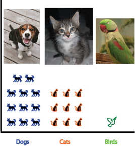
Figure 5. Ownership of pet dogs, cats, and birds in the United States in 2011. Each icon represents approximately 4 million pets.
Different infographic types have different requirements in terms of their story characteristics. Again, using the examples I started this article with:
Other types of infographic will have different story or rhetorical characteristics. For example, Figure 6 shows how one might describe the flow of aluminum from ore to final product in a major aluminum-producing region of North America. Note that the choice of wording emphasizes the environmentally friendly aspects of aluminum, which is a defensible choice, without acknowledging the downside of these flows (e.g., strip-mining in the areas where ore is produced, flooding of aboriginal lands in Quebec to produce hydroelectric reservoirs, production of greenhouse-effect gases during transportation of products)—an equally defensible, though less honest, choice.
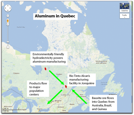
Figure 6. The flows of aluminum ore (bauxite) into the province of Quebec, of the electricity that powers its conversion into metal at one key location, and of products to suitable markets. Not shown: the return flow via (for example) recycling of aluminum cans. (Map courtesy of Google Maps.)
If the goal of an infographic goes beyond the mere presentation of information, to persuade the viewer to adopt a belief, make a decision, or perform some action, consider the traditional tools of Aristotle’s rhetoric. These include:
The Romans elaborated on Aristotelian rhetoric through additional persuasive strategies. Among the most relevant for creating effective infographics:
Ethics suggests that the images we convey in an infographic must be accurate and evenhanded, but both criteria may be waived in certain circumstances. For example, to present the complex global warming issue to a general audience that may not understand the complexity of the underlying science, your infographic may need to simplify the details so that the broad details of the problem can be easily grasped. Trying to explain the complexity of the underlying details is best left to infographics used in efforts to persuade experts who see these details as proof that you are considering all aspects of the problem, weighing the evidence, and providing a judgment based on this evidence, rather than non-experts who see this complexity only as confusion. Thus, it’s perhaps more correct to suggest that from an ethical perspective, the messages you convey in an infographic must be broadly correct and honest, rather than precise. In short, the goal of an infographic can legitimately be to simplify a complex concept—without oversimplifying to the point that you are no longer presenting the truth. A good compromise between clarity and complexity would be to provide links to additional sources so that viewers who have accepted the basics of your story can learn more, or can at least confirm the details.
Although you might think of USA Today or the evening TV news when you think of infographics, the subject is much deeper and broader. Thus, I’ve provided many references to help you explore the topic further. But you should also think beyond the conventional notion of an infographic: a static image on a printed page. Two horizons include using sound in online images to support the blind (i.e., the use of sound to support what was formerly purely visual information), and using animation to create dynamic visuals (such as my example of the animated image of how a key works). Imagine how useful these techniques would be in technical communication. For example, assembly manuals presented on a tablet computer such as an iPad could include animations to show how parts move together during assembly and visual indicators of successful and failed assemblies, and individual steps could be accompanied by spoken descriptions for steps in which all of your attention must be focused on what your hands are doing rather than on the instructions on the tablet. Wikipedia provides a nice assortment of online tools and social media sites that can be used to create effective infographics, including the Visual.ly site for data graphics. Infographics hold enormous power for storytelling, and we’re only beginning to explore their possibilities for effective technical communication.
[A look back: The BrainPicking site ran an interesting article on infographics that provides some excellent examples of this genre.—GH]
Bertin, J. 1983. Semiology of graphics. Diagrams, networks, maps. (Translated from the original 1973 French version by W.J. Berg.) University of Wisconsin Press, 456 p.
Hart, G. 2006. Abstraction: making the complex easier to understand. Intercom November 2006:36–37, 40.
Hart, G. 2007a. Combining words and pictures: degrees of abstraction. Intercom January 2007:38–39, 42.
Hart, G. 2007b. Some thoughts on visual vocabulary, grammar, and rhetoric. Intercom May 2007:36–38.
Hart, G. 2010. Integrating text with graphics in procedures. Intercom December 2010:17–19.
Macaulay, D. 1988. The way things work. Houghton Mifflin/Walter Lorraine Books, 384 p.
McCloud, S. 1993. Understanding comics: the invisible art. Kitchen Sink Press, 216 p.
Tufte, E. 1983. The visual display of quantitative information. Graphics Press, 197 p.
Tufte, E. 1990. Envisioning information. Graphics Press, 126 p.
Wurman, R.S. 1989. Information anxiety. Doubleday & Co. Inc., 356 p.
Wurman, R.S. 2001. Information anxiety 2. Que Books, 308 p.
©2004–2024 Geoffrey Hart. All rights reserved.