|
–Geoff-Hart.com: Editing, Writing, and Translation —Home —Services —Books —Articles —Resources —Fiction —Contact me —Français |
You are here: Articles --> 2010 --> Subjecting theory to a reality check
Vous êtes ici : Essais --> 2010 --> Subjecting theory to a reality check
by Geoff Hart
Previously published as: Hart, G. 2010. Subjecting theory to a reality check. Intercom Sept./Oct. 2010:27–28.
Research-backed theory provides design guidance that can keep us from traveling too far down blind alleys. It also points us towards proven solutions so we don't have to constantly reinvent the wheel. This is why I've introduced judicious doses of theory since I began this column: to demonstrate that it's relevant and not as scary as you might have thought.
Unfortunately, there are compelling reasons why we should examine theoretical knowledge skeptically. Here, skepticism does not mean we should distrust everything we read; instead, it means we should judge research critically, demanding evidence but retaining an open mind. More importantly, we must ask ourselves why and when a design recommendation might be relevant—or not—and what this means for our designs. Let's consider an example in which basing a design strategy solely on theoretical guidelines might lead us astray, then extend that example to learn how this insight will shape all our work.
Powerful insights can arise from situations so familiar that we no longer question them. Consider, for example, a standard deck of playing cards. Typical card designs includes three components:
Let's reconsider this design based on the guideline that a design's most important components should be positioned centrally, where our eyes will come to rest, and should be easiest to detect and read (i.e., largest or most prominent). On this basis, typical cards are poorly designed: the dominant central image is purely ornamental, inefficient (the iconic shapes must be counted to learn their number or examined to distinguish a king from a jack), or redundant (it conveys no information the peripheral images don't convey faster). The only crucial element is the combination of a number or letter with an icon that communicates the suit; together, these communicate everything we need to know about the card. Is a redesign in order? For example, could we banish the purely ornamental information and retain only what's crucial? Could we make the number and icon large and prominent, and move them to the center of the card, where they occupy the focus and most of the available space in accordance with their importance?
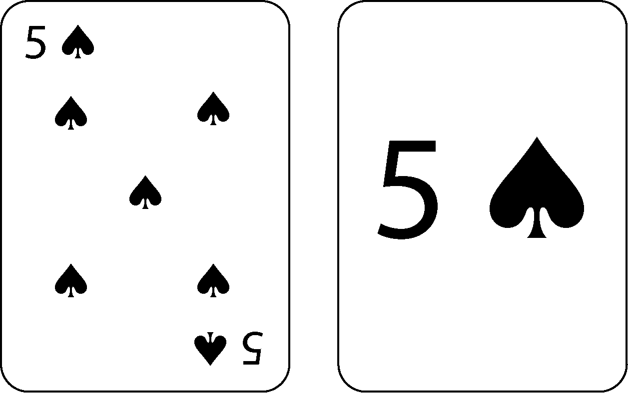
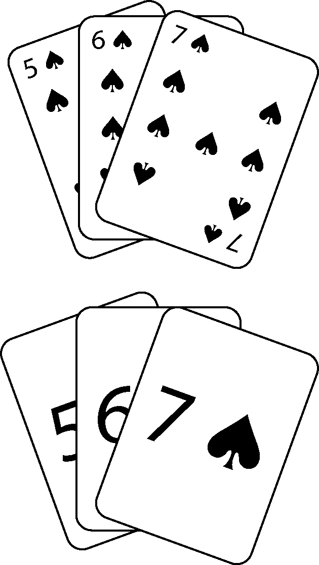
Figure 1 compares the two designs. Though the redesigned card seems superior based on the design guidelines, it looks a bit odd. Moreover, we've forgotten to consider the use context. During a card game, players most often hold their cards in one hand, fanned out so only the number and icon are visible (Figure 2). In our proposed redesign, the key information is concealed, except for the topmost card. Moreover, if a card is dealt upside down, we must invert it so we can see its identity. In the original design, the number–icon combination handles the task at hand simply and easily, particularly once users learn to locate, read, and understand the paired symbols that identify a card. In seeking a minimalist solution, we also ignored the power of pattern recognition. Pictures on the face cards (King, Queen, and Jack) instantly communicate their different roles, whereas the central patterns formed by increasingly large numbers of icons convey the card's value at a glance. Relying on such visual cues is a powerful tool in games such as poker, when players must also watch for crucial non-textual cues transmitted by the faces of the other players.

Figure 1. The design of a typical playing card (left), and an "improved" design (right) that presents only the key details.

Figure 2. Fanned-out hands of cards, revealing problems with the "improved" design.
We must also acknowledge certain conventions. Modern playing cards have resulted from hundreds of years of evolution, and we ignore this at our peril. Sometimes we must retain a theoretically inferior design simply because it works so well that its familiarity trumps its inefficiency. This is why most readers of this column still use the standard QWERTY keyboard instead of the more efficient Dvorak layout. We must also remember that esthetics plays a role in how a design is perceived. A purely minimalist playing card that is white on both sides and that contains only a single number–icon combination at the center would be efficient, but would it be pleasant to hold and use?
This example shows that even when theory can guide us to a superior design, we should challenge the assumption that theory alone is sufficient. In particular, as Figure 2 shows, we must test whether a given guideline remains valid in the actual usage context. Ideally, we should learn this by watching real users working with our design, but in a pinch, we can take on that role and try the design ourselves. That won't reveal everything we must learn, but will reveal the most egregious mistakes. (Most consumer products would be easier to use if the engineers who designed them were forced to actually use their own designs.)
Next, now that we understand the usage context, we must identify which design guidelines remain relevant. For the cards, the relevant guidelines are that the card's number and suit must be clear, must remain visible when the cards are fanned out in one hand, and must be sufficiently familiar they don't distract players from more important factors, such as keeping an eye on other players. Other guidelines remain valid but must be adapted to the usage conditions. For example, it's reasonable to want to maximize the size of the numbers and icons that communicate a card's identity, but there's undoubtedly a smaller value that is be good enough. Enlarging the cards to double their usual size would provide more room for the key images, but the deck must still fit in your pocket and the cards in your hand.
The usage conditions may render some guidelines invalid. For example, if we are designing playing cards for an audience that has difficulty reading small text, using larger text and icons than we would choose for a general audience would make the design work well for all sighted audiences. But for those who are actually blind, this won't help. We could make the cards more usable by adding Braille equivalents to the number–icon combination, but not without addressing the usage context: the uniform backs of playing cards ensure that other players can't tell what cards we're holding, so the Braille would have to be one-sided to conceal a card's identity from other players.
As this analysis shows, we can certainly start with conventional design guidelines that have been proven to work well in a range of situations, but we must test each guideline to ensure it's valid and relevant in the actual usage context. We may need to add design guidelines to account for unique features of that context, modify guidelines so they better accommodate the context, and discard guidelines that aren't relevant. And we must never forget the final step: testing the resulting design to learn what we missed.
©2004–2026 Geoffrey Hart. All rights reserved.