|
–Geoff-Hart.com: Editing, Writing, and Translation —Home —Services —Books —Articles —Resources —Fiction —Contact me —Français |
You are here: Articles --> 2008 --> Typography 101A: the role of white space in making lines of text readable
Vous êtes ici : Essais --> 2008 --> Typography 101A: the role of white space in making lines of text readable
by Geoff Hart
Previously published as: Hart, G. 2008. Typography 101A: the role of white space in making lines of text readable. Intercom July/August 2008:30–31.
In previous articles, we've seen how white space functions at a macro level to define the components of a page (margins, gutters, type, and graphics). But white space also has crucial functions at a micro level: it groups words into lines of text, groups individual characters into words, and separates lines, words, and characters. In this and the next two articles, we'll explore a subject in which there's no black and white: typography.
But first, a few definitions: Legibility means how easily readers can distinguish individual characters from each other (e.g., a versus d) and from their background (paper, computer screen). Letters that differ strongly from each other and from their background are legible, whereas legibility suffers when the contrasts are too small; for example, this is true of the lower-case L and the number one (l and 1) in most fonts. Type must be legible before readers can recognize words and assign meaning to them (comprehension). Reading efficiency describes how legibility permits fast and error-free reading. All else being equal, legible type can be read faster, with fewer word-recognition errors.
That being said, let's consider three aspects of white space that make text readable: line length, spacing, and justification. We'll discuss words, letters, and typefaces in the next two articles.
Typographic convention states that for optimal reading, lines of text should average between two and three alphabets long (i.e., 52 to 78 characters). Why might this be? For one thing, this length typically fits the entire line within a single field of vision at the expected viewing distance, and doesn't force readers to move their eyes far to the left or right. To see how this works, try this test: stare at a single line of type in this article and pay attention to the zone of relatively clear vision. If you're like most readers, that field of view will typically span about 52 to 78 characters at a typical reading distance, with text outside that field growing increasingly fuzzy unless you move your eyes. As this test shows, reading is analogous to looking at the page through a toilet paper roll and sweeping its opening across the text. Obviously, the numbers aren't absolute and the metaphor is inexact, but they illustrate the basic principle nicely.
Eye movements within the field of view are unnoticeable unless you concentrate. But what happens if lines are longer than a field of view? When the line of text is wider than your field of vision, your eyes must move horizontally (or your head must turn) to sweep the field of clear vision across the rest of the line. To literally feel why line length is important, try this test: turn your head so you can focus on the left edge of a two-page spread in a newspaper without moving your eyes, then, without moving your head, turn your eyes to the right so you can focus on the far right edge of the spread. Feel how your eye muscles have to stretch to bring that part of the page into your vision?
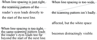
When your eyes reach the end of a line, they must jump back to the beginning of the next line before you can continue reading. This is why you'll often hear reading patterns described as a Z: the Z's two horizontal strokes (—) represent reading from left to right within two adjacent lines of text, whereas the diagonal stroke (/) represents the return of your eyes to the start of the next line. With adjacent lines spaced too tightly, readers often skip more than one line when their eyes return to the left margin, forcing them to back up a line before they can continue reading and complete the thought process they began on the previous line (Figure 1). The more often this occurs, the greater the disruption of the reader's thought and the less efficient reading becomes. Excessive line spacing eliminates this problem, but decreases reading efficiency by introducing visually distracting white space. As previous articles suggest, overly widely spaced lines may even appear to belong to different paragraphs, particularly if line spacing approaches the spacing between paragraphs and there are no other clues such as first-line indents to assist comprehension.
Figure 1. Optimal line spacing guides the reader’s eyes efficiently between lines. Too-wide spacing creates distracting “white space”; too-narrow spacing causes readers to jump to the wrong line. The Z shape superimposed over the text illustrates how the eyes move between lines.
Optimal line spacing helps guide the reader’s eyes to the start of the next line. There are no universal rules of thumb that define "optimal" leading, since this varies with factors such as line width, type size, and the display medium. The automatic leading in most modern desktop publishing software represents a good starting point for many purposes, but can also fail quite spectacularly, as the following test reveals: Type (or copy) a paragraph of single-spaced text in your word processor, then resize the document window until it's only a handful of words wide. You'll have no problem reading, and won't skip many lines. Now stretch the window until it's as wide as your screen. At this greater width, you'll find yourself jumping far too often to the wrong line when you sweep your eyes back to the left margin. To determine whether you've chosen an effective line spacing, try reading a trial layout while paying attention to how often you skip lines or find yourself being distracted by the white space between the lines. Increase or decrease the spacing (respectively) to solve the problem.
Designers often argue over the justification of lines of type. Those who prefer full justification (justified at both margins) note the tidiness of the columns of text and claim that the predictability of the left and right margin positions aids reading; the reader's eyes quickly learn how far to move before jumping back to the left margin. Those who prefer ragged right margins claim that fully justified text creates distracting “rivers” of white space flowing through the paragraphs, and that hyphenation at line ends to eliminate this problem produces a “picket fence” effect along the right margin (Figure 2). That pattern is both a visual distraction and a burden on cognition because readers must reassemble the hyphenated words before they can comprehend them. Both groups are justified in their opinions, but in practice, there's little practical difference in reading efficiency between the two approaches if the designer minimized rivers and hyphenation.
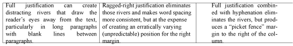
Figure 2. Full justification (left) can create distracting white “rivers” that are eliminated by ragged-right justification (center). Hyphenation shrinks the rivers, but excess hyphenation creates a picket fence effect (right).
Good typography is complicated because it forces us to balance the interactions among many factors simultaneously, and there are rarely absolutes. For example, the closer you hold your face to the page, the narrower the field of vision; the farther you move from the page, the wider the field. As you move closer to the page, you can comfortably read smaller type, so line length can remain "two alphabets" if you use smaller type; conversely, at greater distances, type size must increase to permit comfortable reading. This is why body text in a novel requires less leading than "display type" on billboards, which are viewed at greater distances that shrink the perceived space between the lines. Although the ratio of line length to leading may be identical, lines of text in this newsletter will be less than 3 inches wide and separated by roughly 1/6th of an inch, whereas billboard text may be 70 feet wide, with lines spaced at a foot or more. Yet both are equally easy to read! [A look back: If you're reading this in your Web browser, the line width is completely under your own control. Stretch the window until you achieve a width that is comfortable for your eyes. Similarly, feel free to zoom in or out to change the text size.]
In the next column, we'll move to an even more micro level and explore the spaces between words and characters.
©2004–2025 Geoffrey Hart. All rights reserved.