|
–Geoff-Hart.com: Editing, Writing, and Translation —Home —Services —Books —Articles —Resources —Fiction —Contact me —Français |
You are here: Articles --> 2010 --> Integrating text with graphics in procedures
Vous êtes ici : Essais --> 2010 --> Integrating text with graphics in procedures
By Geoff Hart
Previously published as: Hart, G. 2010. Integrating text with graphics in procedures. Intercom December 2010:17–19.
Combining words with graphics is an ongoing challenge for information designers, but one that's interesting from both a design perspective and a practical perspective. Practicality is an issue because for many technical communicators, graphics must be created in such a way as to facilitate machine-assisted translation of their textual components. Because most translation tools are optimized to work with word processor or desktop publishing files (whether Word or Framemaker), text within a graphic is inherently difficult to extract and translate. In this article, I'll discuss the advantages and drawbacks of the following solutions:
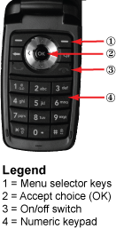
In this approach, we number the image's components in the order in which we discuss them in the accompanying text, which often follows the physical structure of the thing we're describing. For example, in describing the parts of a cell phone, the order may follow the structure of the device, usually with numbers starting at the top left of the image and proceeding clockwise around the image, or it may simply trail down the side of the image (Figure 1).
Figure 1. A numbered inventory of some key parts of a cell phone.
The numbers are tied directly to the accompanying key or legend, which explains what each number represents. Once you find a part in the image, the associated number makes it easy to find the corresponding explanation, since the numbers appear in clear numerical order within the key. Although I created Figure 1 in Adobe Illustrator to facilitate publishing of this article, the image and its explanatory key could instead have been stored in two adjacent cells in a word processor table, making it easy to translate using standard translation tools, which have little difficulty extracting text from tables.
The primary disadvantage is that this approach separates the symbol (the number beside part of the image) from its meaning (the text in the key). That increases the cognitive difficulty of using the graphic because readers must leave the task at hand (examining the graphic) to perform a secondary task (finding a number in the key to read its explanation), then must return to the image so they can ponder the relevance of that explanation. For the multiple steps of a procedure, readers must juggle all this information simultaneously, which can be difficult. This approach is therefore most effective as an inventory graphic, when the reader's goal is to figure out what a specific part of an image means: since they won't return to the image repeatedly, the additional cognitive effort is less of a problem.
When an image's goal is to support a task rather than simply identifying the parts of the image, the numbered approach becomes ineffective. The reader's actual task is to follow a sequence of steps that involve different parts of the image in an order defined by the dependencies among the steps of the task. Each time a reader must stop performing a step to consult a key separated from the image, they must re-establish their position within the task and pick up where they left off. The greater the physical separation between the image and its explanation, the greater the difficulty because of the increased burden on working memory.
To solve this problem we can move the explanations directly beside the part of the image they explain (Figure 2). The explanation remains within the same visual field as the part of the image it explains, eliminating the back and forth that takes readers away from their task when a key is used. If the explanations follow a logical sequence, numbers may be unnecessary, though they provide useful redundancy by reinforcing the concept of numbered steps (i.e., of a sequence). Sequences that require no explanation move from left to right, from top to bottom, or a combination—for example, left to right across the top of the image, then top to bottom along its right edge. Of course, that sequence should be revised in right-to-left languages such as Hebrew, so if you have no budget to localize such images, the numbers are essential because they clarify the sequence. However, some objects (such as dialog boxes) do not follow a logical task-related sequence, making it difficult to arrange the callouts so the sequence within the image matches the sequence within the procedure.
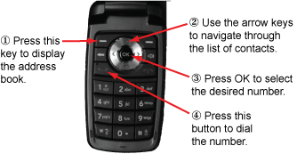
Figure 2. Performing the steps in a procedure that uses the cell phone.
This approach is concise, because the entire procedure occurs within a single image. Because each explanation points at the part of the image it explains (typically using call-out arrows), there's no need to waste words describing the location or the object. The reader's focus remains on the task at hand, making it easier to complete the task. This approach is therefore excellent for procedural information. The primary disadvantages are that the approach complicates machine-assisted translation (particularly when images are created using poorly supported features such as Word's text boxes), and that it requires additional graphics work to crop larger images until the result presents only the image components that relate directly to a specific step. You can make this more efficient if you create a series of reusable standard images that focus on specific features.
If you prefer to avoid the step of repeatedly cropping an image to create a reusable subset of that image, most image-editing software provides simple alternatives: draw a circle around the most relevant area, or select that area using the selection tool and invert the selection, then grey out all irrelevant parts of the image using the "levels" command (Photoshop) or similar features (Figure 3). Both approaches retain context (i.e., where each part is located within the overall image) while focusing reader attention on the key parts of the image.
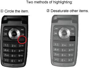
Figure 3. Two ways to emphasize parts of a photograph.
For complex procedures, it's sometimes most effective to create one image for each step. In this case, the explanation of each step can be concise (pointing at the feature with an arrow eliminates the need to describe its location), and can focus on only a single component of the image. A nice advantage of this approach is that the images can appear in the left column of a two-column table, with the explanation of each image in the right column, thereby facilitating machine-assisted translation. Steps that don't require visual explanations (e.g., "Get a coffee... this will take a while to finish") can span both columns of the table (Figure 4).
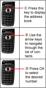
Figure 4. Using a table to combine text and images.
One drawback is that this takes considerable space: instead of a single image per procedure or part thereof, this requires up to one image per step. That isn't a problem for online information, but can be a barrier in printed documentation. Nonetheless, I've used it successfully both online and in print where this represented the best solution. If you must also produce versions for right-to-left languages, it's easy to modify this approach: present the instruction on one line of the table, followed by the associated graphic on the next line. (All languages I'm familiar with are read from top to bottom.)
Since each approach solves a different problem, we must often combine solutions for more complicated problems. For example, writing the user manual for a chemical laboratory analysis might require all three types of graphic:
In each design, the goal is to understand what reader needs we're trying to satisfy. Once we know those needs, this article can help you choose which approach will most efficiently meets their needs, while remaining efficient for you to create and for your colleagues to translate and localize. I've successfully used all of these approaches to create quickstart guides for nontechnical workers, who loved them because the solutions focused specifically on their needs.
©2004–2025 Geoffrey Hart. All rights reserved.